Maybe not, now I’ve added max-min times to the large garden temp block: I don’t really need the small block any more.
OK, gone to wide mode - url as left but change /pws/ to /pwsnew/. It’s growing on me, but the title is not centred :roll:
I suspect that it might be if I get rid of the orange °F button.
[quote author=bitsostring link=topic=67842.msg548293#msg548293 date=1562613228]
OK, gone to wide mode - url as left but change /pws/ to /pwsnew/. It’s growing on me, but the title is not centred :roll:
I suspect that it might be if I get rid of the orange
I saw that, thanks.
it seems the tile is 20 px off as the left object (F) is margin 200+20px wide, right object (clock) is 200px. So if you make the clock 220px wide the title should / is in the middle.
Perfect, if you leave the left object alone! See “before.png” and “add20pxtoclock.png”, below.
But if you remove the left object first, as described in the other post, the title gets worse. See “removeFCbutton.png”.
So you have to add the 200 px back, in line 374 of w34_index2.php, and leave the clock alone. See “add200px to leftoftile.png”.
I want to get rid of the time in the head-line, to much space and problems when resizing
I do not want to waste a full small block for the time
I want the weather-advisories without a headline, the contents of the box say it all
I always want the most used || important parts at the beginning of the page = left+top
What do you think , it this acceptable => http://wd34.weather-template.com/pws07/
Wim
Took me a long time to find it but, yes, I could get used to it.
Maybe clock font one pt larger, with a bit more space between clock and date?
On a very personal note I always add GMT or GMT+1 to my clocks, especially since the old “Local Time” heading disappeared, because I struggle with PST, EST, BST, CET, etc. I think it makes it easier for visitors, but it does eat up real estate.
And I prefer Lucida Sans for the clock ![]()
P.S. You could put the °F/°C button back on the right!
That would work for me…
What do you think about reversing the order? (Date, Time) instead of (Time, Date) :scratch: :-k
Just throwing out the idea, either one would be OK.
I agree :thumbright:
Got caught out here because I’d moved the small advisory block to position 4 - worked OK until there was an alert. See the story here.
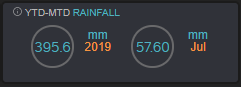
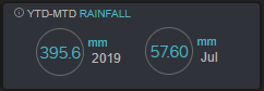
Back to the original release (url as left), and modified a small temp block to show YTD-MTD rain so it matches the others in the top row. It was easier than trying to modify the old small rain block. . .
And added an Oregon Scientific logo at bottom right ![]()
I think the time has come for me to show my version of the July release as my standard page: see url at left. (Original Jan release now at /pws1901/)
I have tinkered with every block and every popup, and it’s just about where I want it to be. I doubt if I’ll be able to resist the temptation to tinker a bit more in the future, however ![]()
Spoke too soon. . . removed all the Xs from popups and corrected the graphs (with Wim’s help!) and now all my popups have a white right border. More tinkering needed :?
Yes a conflict with an old css or javascript.
Just do a force reload (ctrl-F5) and the css will be reloaded.
I will add a version number to all css/js with the October release.
Wim
As simple as that?!! I often do ctrl-F5 if something doesn’t seem to be working, but it was late last night when I noticed the problem. . . #-o
Thanks, Wim ![]()
Just tinkering, now, but after a few false starts I managed to get the graphs to show “Temperature (°C)” instead of “Temperature (C)”.
![]()
![]()
More tinkering. . .
Changed the range on the barometer a little (100 hPa to 80) to improve resolution, and altered the script so I only have to change max &/or min scale values to make it happen.
Slimmed down the wind compass a bit, to match other circles. . . not sure about arrow colours yet, orange* and green are a bit bright? Also changed “Direction (Avg)” to “Direction (10-min Average)” at bottom left ( clientraw #176 instead of #117) because my anemo is too low/too near the houses to give steady readings so a longer average smooths it a bit. (Not a lot!)
Definitely not sure about colours for temp and garden temp block circles. I wanted to get rid of the shifting “gradient” colours but can’t decide what to use instead. Current colours match the most common earthquake circles! Edit: too much blue now, back to red for temp.
- Decided to use a paler orange for direction and arrow.
Template now on a secure server running PHP 7.2. I am relieved that there are no obvious PHP errors after all my mods!
Menu extras WDL and SteelSeries Gauges are not yet working properly. . . “So it goes.”
EDIT: WDL and SS Gauges working now ![]()
Finally managed to get an Official AQI API key and set up the AQ block. Modified slightly (as discussed here) to show the local official AQI and separate AQIs for PM2.5 and PM10.* Once again, thanks to Wim for his encouragement ![]()
Also added Danish language, thanks to Gert (gand), to go with Torjan’s Norwegian.
*And now the dominant pollutant, too.
Looks great.
I have been working on a AQHI display from Environment Canada. Got the current values displaying, now to reformat and add forecast.
That looks good, too ![]()