I’m not totally convinced of the cause of the trailing space, but since you have one then trim() is your friend ![]()
Just minor fiddling. . .
Always seemed strange that rain Almanac was ordered “Year, Month, Last Hour, Yesterday”, so I changed the last two items around.
New title for small rainfall block: used to be “Annual Rainfall” but the month is in there too. (I haven’t changed all the translations, so apologies for that!)
I tried swapping Rain and Earthquake blocks, so Rain was on the bottom row with other square items, but it didn’t look right. . . swapped Webcam and Earthquake blocks instead.
Just to be persnickety ![]() Why do you have a combined “UV Index|Cloudbase” footer option on 3 blocks and separate “UV Index” “Cloudbase” footer options on another.
Why do you have a combined “UV Index|Cloudbase” footer option on 3 blocks and separate “UV Index” “Cloudbase” footer options on another.
Is it possible for the title "Swanston Grove
I haven’t managed to get the CSS right for the combined block, and I left the others so I could easily view and “Inspect” the relevant bits in the browser to see what I’d missed. Work in progress. . .
[quote]
Is it possible for the title “Swanston Grove . Edinburgh, U.K.” to be more prominent?
Sorted ![]()
Small change mentioned was only to display “equivalent to” rather than “equal to” for the barometer conversion. . .
All understood, it’s a nice project ![]() I don’t need the title in flashing neon, just seems a bit over understated
I don’t need the title in flashing neon, just seems a bit over understated ![]()
Went to bold and changed the -0.05em letterspacing to +0.03em. . . better?
I like it :thumbright:
Six months in and I’ve finally worked out how to show rain to 1 d.p. for mm and 2 d.p. for inches, with trailing zeros. I’ve left rain rate/hour showing 2 d.p. for both. (This release can’t show rain rate/min without more work, and I’m not really interested anyway.)
Small YTD-MTD rainfall block has a temporary “real-estate” solution: for both mm and inches, if ($amount<100) show 2 d.p.; for (100<$amount<1000) show 1 d.p.; ($amount>1000) show 0 d.p. Seems like a workable balance?
Yes, good solution.
Starting to fiddle with the July release now. . . URL as left but change /pws/ to /pwsnew/
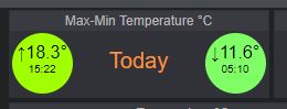
I really need to get the max-min Temp circles away from the edges of the small block (temp.jpg), but I’m having trouble. . .
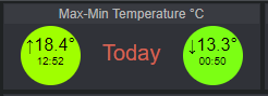
Edit: If at first you don’t succeed. . . try again (temp2.png).

Managed to put together small max-min and large temp blocks for garden temp - and added UV and cloudbase.
Also managed to sort the max wind time in the small max wind|gust block. . . may have to change to wide mode so I can show that too ![]()
Maybe not, now I’ve added max-min times to the large garden temp block: I don’t really need the small block any more.
OK, gone to wide mode - url as left but change /pws/ to /pwsnew/. It’s growing on me, but the title is not centred :roll:
I suspect that it might be if I get rid of the orange °F button.
[quote author=bitsostring link=topic=67842.msg548293#msg548293 date=1562613228]
OK, gone to wide mode - url as left but change /pws/ to /pwsnew/. It’s growing on me, but the title is not centred :roll:
I suspect that it might be if I get rid of the orange
I saw that, thanks.
it seems the tile is 20 px off as the left object (F) is margin 200+20px wide, right object (clock) is 200px. So if you make the clock 220px wide the title should / is in the middle.
Perfect, if you leave the left object alone! See “before.png” and “add20pxtoclock.png”, below.
But if you remove the left object first, as described in the other post, the title gets worse. See “removeFCbutton.png”.
So you have to add the 200 px back, in line 374 of w34_index2.php, and leave the clock alone. See “add200px to leftoftile.png”.
I want to get rid of the time in the head-line, to much space and problems when resizing
I do not want to waste a full small block for the time
I want the weather-advisories without a headline, the contents of the box say it all
I always want the most used || important parts at the beginning of the page = left+top
What do you think , it this acceptable => http://wd34.weather-template.com/pws07/
Wim
Took me a long time to find it but, yes, I could get used to it.
Maybe clock font one pt larger, with a bit more space between clock and date?
On a very personal note I always add GMT or GMT+1 to my clocks, especially since the old “Local Time” heading disappeared, because I struggle with PST, EST, BST, CET, etc. I think it makes it easier for visitors, but it does eat up real estate.
And I prefer Lucida Sans for the clock ![]()
P.S. You could put the °F/°C button back on the right!
That would work for me…
What do you think about reversing the order? (Date, Time) instead of (Time, Date) :scratch: :-k
Just throwing out the idea, either one would be OK.
I agree :thumbright: