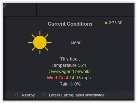
Add solar link to bottom of current conditions block. I don’t like dedicating an entire block to solar, but it would be nice to be able to view it in a pop up window.
If you are into tinkering with scripts, you can edit w34_blocks.php to show the solar pop-up “UV Guide” under almost any block you want. Might not be room for it under current conditions, though?
My page (as left) shows various pop-up links, some no longer needed, scattered all over
One thing I would like to see is that the template can use the canadian version of AQI (AQHI). when the station is a canadian station. This is a scale of 1 to 12+
I would love it if the graphs would display on mobile. But they don’t have responsive formatting, (can’t move or resize). CanvasJS does have code for mobile devices, wonder why it was never implemented.
Because I started with the 2017/2018 versions, it is a one persons hobby for ALL developers and because of a few other personal reasons, like having some time for family also.
Please feel free to fork any of the versions and develop your own version.
Most users already know that there will be 4 versions this year. The July release is fully (> 90%) responsieve, including all graphs. Test at http://wd34.weather-template.com/pws07/
Wim
I’d like to see earthquake data ordered by distance from my station and then by magnitude. As an example, today there was a 4.0 quake around 300 miles from my location, but pws is highlighting an earthquake in Mexico that was a 4.1 but is 2600 miles from my location.
The July release displays a table in the pop up which you can sort dynamically by distance or time.
The large block can be set to do that in the script. The small block always tries to find the most important earthquake nearby.
Test here http://wd34.weather-template.com/pws07/index.php
Hi
The feels like temperature which appears on this excellent template is different to that calculated by using the (seemingly) universally accepted formula found at: http://www.bom.gov.au/info/thermal_stress/
Are there any plans to use the above quoted formula in this template in the future?
Well…I’m very sorry to say this, but I liked the graphics on April version better. New version has become too sterile. The round elements added some humanity. Weather sites are boring for many ppl. (my GF thinks this is a waste of time) It was nice to have some graphic elements that were not so square.
The original W34 designer had a big background in graphic design, and that appears to be lost now.
You can always continue to use the April version or any other version. A lot of users customise a version and continue to use them for years. One of them even has a a topic about his effort and successes on this forum.
No it is not sticky yet. Nobody whose uses another language as English, wanted it so far.
With the round option most texts will not fit and IMHO the other HWS templates changed to square also for that reason.
I will put it in the menu and in easyweathersetup.
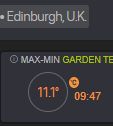
What I liked about the early templates (“I design simplicity”) was the understatement. Nothing shouty, no really bright contrasty colours, no advertising-agency feel. And that’s what I’m trying to keep going on my page: I even wonder if I’ve gone too far with the bright bars in the Garden Temp “Feels Like” column. . .?
On the debit side we have inherited from him the fashion for numeral 1 to be narrower than all the others. But 10 should appear the same width as 11 or 12 or 99, and then you can align them easily (example.png shows left-alignment OK but it’s ruined by the figure 1 on the right!). Wim changed the clock, for which I am eternally grateful, but I shudder every time I see, e.g., 11.1 as in example2.