Cellphone/Mobile Scripts (XHTML Mobile 2.3 Certified)!

They are just addons to Saratoga.

Based on the original files from Bashewa and K3JAE, Relayweather and Webster Weather and enhancements from many others… I dont claim to originate these, I just “moderized” them and added some flair.

You will need to look at every file. I made a cell-top (think the merging of top, header and menubar). I also have a cell-footer.
make sure to check each page – even header and footer for the links to your website and your website name and location

The main page cell.php calls out cell-ajax.dashboard.php. Then there are tabs for cell-cam, cell-forecast, cell-radar, cell-advisories.

note: cell-radar 2nd image has a link to your lat and long and a name that you can put on the image – change that 2 your location

Note if your NWS center does NOT have a synopsis, the cell-advisories page will look weird…

I cleaned up the css file a bit and even have a background. But feel free to change any of that…

GRAPHICS not included – if you need any of them I will let u know where to get them or post them… All of them were from the forums.

In the 2nd zip is mainly the thermometer file which is from Bashewa with mods from Relayweather

Hope you enjoy…

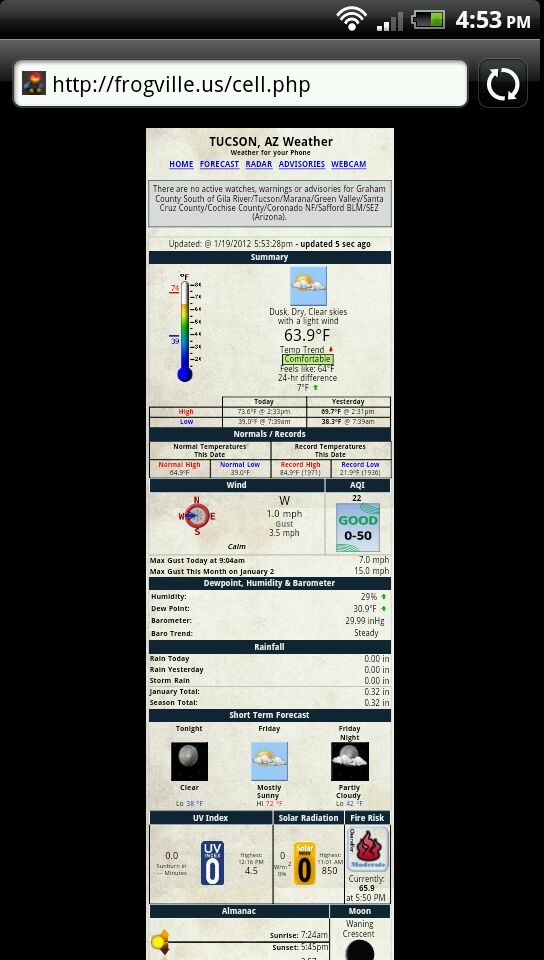
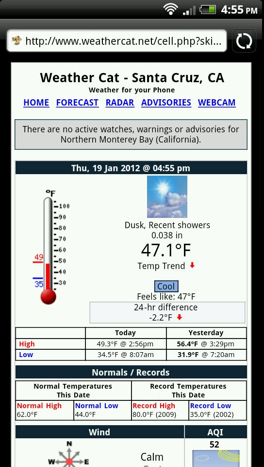
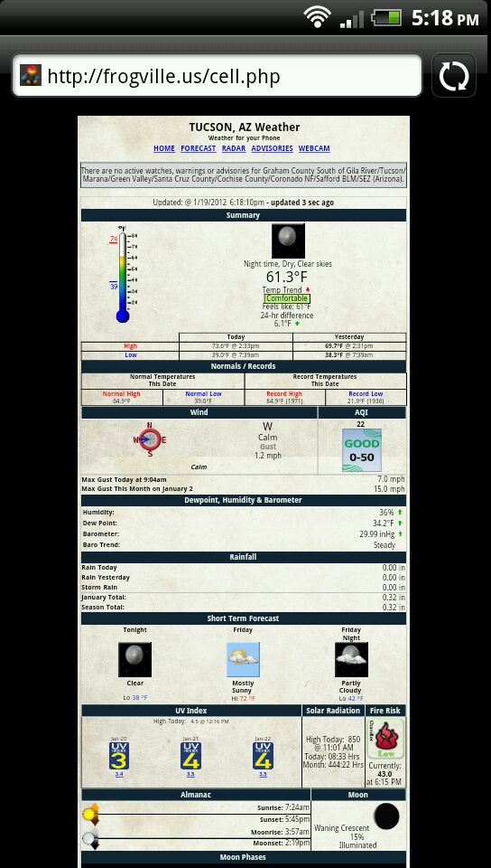
here is what they look like…

http://frogville.us/cell.php


cell-template-a.zip updated…

Had extra footer.php in zip and found 2 minor css errors in handheld.css and cell-ajax-dashboard.php (forgot to validate the css…doh! )

– 1/20/2012 updated for the UV/Solar issues found the previous day.

To set the width modify the css file look for “max-width” towards the bottom of the file and cell-top the variable $pagewidth

Fire/chandler icons use what ever icons you want just make sure they are called “CBI-Fire0.gif”, “CBI-Fire16.gif”, “CBI-Fire25.gif”, “CBI-Fire31.gif”, “CBI-Fire32.gif” or modifiy the cell-ajax-dashboard.php files to change to whatever you want.

Fire icons from

http://www.burnsvilleweatherlive.com/wxScripts.php
or
http://www.bashewa.com/downloads/bws-icons-fire.zip

Background images in “a” zip are for cell-ajax-dashboard make sure you put them in ajax-images

1-20-2012 v2 fixes

added support for iphone page width. (transparent to the user). fixed formatting issues on cell-forecast page.

Note – if you are using the alt-dashboard js files (from webster weather), you will need to edit the ajaxWDws.js

Find the //feelslike section and replace it with this…


// FeelsLike ... (

---

[cell-templates.zip|attachment](upload://rXlIqBRBu1vO89Tko8vEGJN4Tqn.zip) (263 KB)

Very nice. 1 thing. Your update clock doesnt seem to update.
I see the wind change but the clock is static.

Fixed, plus added ajax to rain… That wasnt there…

new cell-ajax-dashboard.php attached.

I tried your new script but it no longer opens to the width of my phone like it did before, it now opens like a normal web page would with the page in the middle with black on both sides.

did you replace the css file?

I did. I even checked your page and it opens the same way.

you must have wide phone?

I have a HTC Sensation 4g with a screen rez of 540 x 960.

change this line

@media screen{
#container {
max-width: 320px;
}
}

to something bigger

I have a blackberry and i found I can go up 360… I can change the forecast synopsis to 50 now also. So maybe I need to writeup some documentation on some changes for different screens…

Im going back and changing the tables to say width=100% etc to make sure they are scaled… I do have some graphics that are fixed size, so that will need to be changed… maybe a variable for all of this?

I made some changes now… I added a variable called pagewidth to the css page and to the cell-top page… I then have all the images scale off that number. I also made the forecast synopsis parse off that number…

So if you guys like this, I can upload these files… Let me know…

That sounds good, with so many diffrent sized screens out there it would be nice to try and fit more than just my own.

Well, I’m trying to implement the script but I have some issues concerning the units.
I use the metric system so I made all necessary modifications in the scripts run in metric.

There are two values that units appear in English system, Current Temperature and Max Monthly
wind gust! All others are fine! Take a look(ignore the translation, I haven’t done with it yet):

http://www.meteothes.gr/cell.php

Anyway, thanks for the fine script!

Thanos

Yeah i’ve started from 2 year old code or so… Let me look into the temp and wind thing…

Your forecast page and webcam page will need to be updated lol :slight_smile:


let me know if this fixes your unit issue…

There is a request for a different fire index I will try to update that later and re upload scripts since I changed the width parameters…

Can someone help me out on fire index? Bashewa put out many different sets of graphics…

Right now its hardcoded to use graphics called CBI-Fire0.gif (fire16,fire25, fire31, fire32)… I figured anyone can use what graphics they want and just rename them to that?

Also If using Chander then I report the CBI.

But if using FWI, just report the number out of 31?? So use the same graphics code, but just change what is listed as text?? Am I understanding this?

Updated original “a” file… Included the ability to specify width (modify the css sheet and cell-top). Added Fire weather vs Chandler support. Included new graphic Moon2.png and sun2.png since I had to make them bigger for larger width cell phones…

I’m not sure why but your page dose not open the why it use to on my phone.
I attacked an image from my phone with the way the web page opens from your page and my page with your old script.


I have mine set to 360 pixels. I was doing some experimentation and it appears i can make it 1000 and it will just squeeze to fit… lemme switch it to 540 real quick and let me know what it looks lilke

ok set to 540… let me know if its bigger

It did get wider but it still dose not fit the screen. I think there was something in the old code that made the screen fit the page rather than the page fit the screen, if that makes sense.


Well so the code is working correctly, what can be done is to change the width even larger — or i can tell you what to change in the css to “break” it again … Its all driven by 2 CSS sections…

OLD
body{
background:#000;
color:#000;
font:12px Arial;
margin:0;
padding:0
}

#container{
border:1px solid #ccc;
text-align:left;
background:#FFF;
padding:4px
}

NEW
body{
background:#000;
color:#000;
font:12px Arial;
margin:0;
padding:0;
text-align:center;
}

#container{
text-align:left;
background:url(2.jpg);
padding:4px;
margin:0 auto;
}

I’m not even sure what the old one was doing, it was confused… But in the body section, the text-align:center is needed and in the #container section the key line is text-align:left (to make it not all centered) and margin:0 auto; (the auto is key).

Also the width is controlled by this:

@media screen{
#container {
max-width: 540px;
}
}
(media screen just means what it looks like on the screen), it would have print full width.

So its easy to fix it back to whatever you want… Not sure what I should do with the main release files… I’m thinking specifying a width. On my BB it fills the screen but its narrower than the monster phone you have.