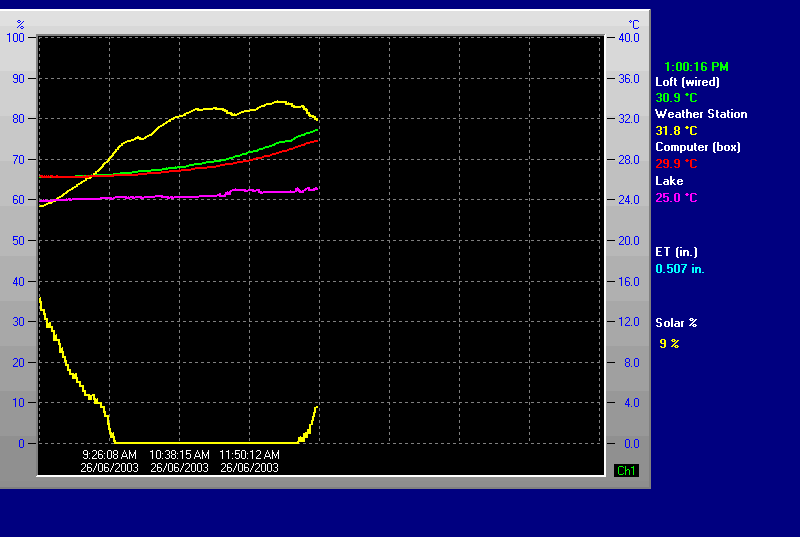
I just noticed that my realtime graph seems out of whack. The temps along the right side seem correct, but what is graphed does not correlate (looks like the scale of the graph is wrong). For instance, the “Lake” temperature on the side seems right at 23 C, but the graph shows it around 38 C.
Here’s the extrarealtimegraph.gif
you most likely have a different scale set for that temperature…
i.e the scale shown is for 1 set of temperature records only
(you can set the scale for each reading now under setup)
Brian,
Where do you adjust the scale - Mine is way off as well.
Greg, right click to get the “extra sensor realtime graph”, and then click “setup” to get the various elements and their scales.
In further review of mine, one of the temps is right and the rest are wrong. Now that our winter is gone here…I know I changed one of them to reduce the scale…and I think I thought that it changed them all.
Brian, why are there different scales for each if it doesn’t accommodate different ones in the output? Shouldn’t it just have a single graph scale?
you have missed the point greg
the scale shown is for 1 of the scales plotted…
but some of the scales plotted might have a different scale to that shown
you can set the scale hi/lo under setup (latest version) so they are all the same
no
you might have temperature sensor in a hot pool or from a solar sensor or from a freezer…
In the graph I posted, the graph point corresponding to the results posted on the left don’t match. For example, the “lake” temperature on the graph shows 38 C, while the value posted on the right is 24 C; the “computer” on the graph shows 48 C, while the value posted is 31 C. The only one of the 4 that look correct is the “loft” temperature at about 33 C.
My system is a remote one so I haven’t had a chance to check.
Brian, I will change all scales to be the same assuming that they will plot correctly. I still don’t get why the values should be plotted wrong is the scale settings don’t match. What good is that?
so is the number on the far right not corespoding to the latest value plotted?
but that is most likely becuase the temperatue scale shown (there is only 1 that can be shown) is not for that temperature…but for another temperature
and so i would set each temperature to have the same scale…
please try to understand this!
however, I think the real time graph needs to consider this in one of 2 ways: (otherwise the graph is incorrect)
- adjust the display to ensure that multiple graphs are plotted appropriately (according to whatever scale is displayed), or
- only allow one scale to be selected for all the realtime graphs
I like to view them all on one graph, and may not appreciate what you are trying to accommodate elsewhere. If this is the case, then I would like you to consider #1 above.
i have already stated you can set each scale to be the same in the setup